

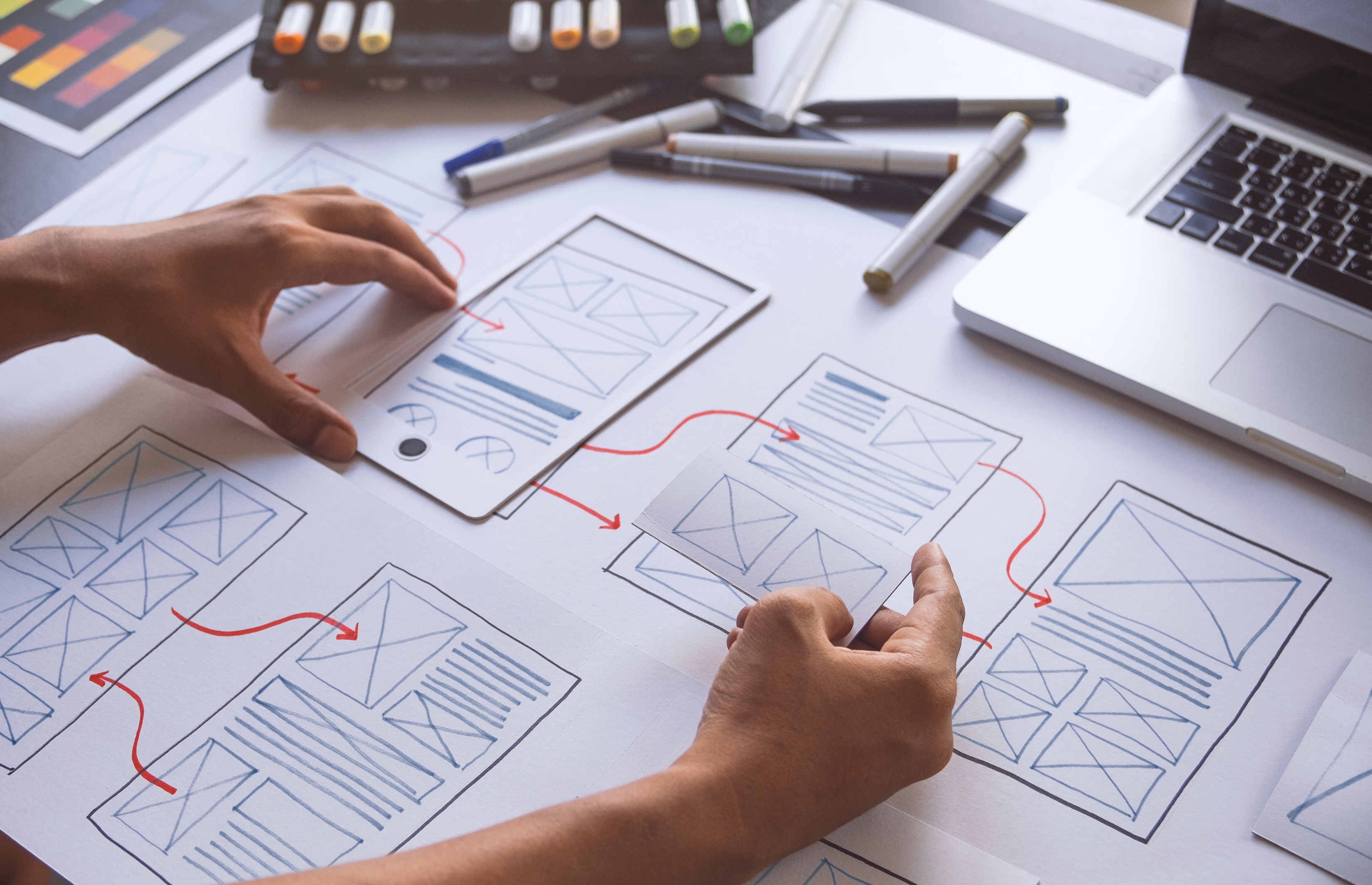
What is Adaptive Design?
There are several design formats you can work with, but here we’re going to talk about Adaptive Design.
When it comes to your website, functionality across different types of devices is something you definitely need to have. It makes it easy for consumers to navigate your information and it boosts the overall user experience.
That’s where adaptive design comes in. This is a user interface that can be modified to a variety of screen sizes. When a user gets online with their device, adaptive design chooses a layout that best fits the user’s screen.
Picture adaptive design as the technological bridge that takes older website designs and instantly transforms them into “flexible” mobile-friendly designs.
What’s the Difference Between Adaptive Design and Responsive Design?
Both are actually pretty similar. Both systems pinpoint the device’s size before rendering content.
The main difference is that adaptive design uses a fixed layout just for the type of device. There are many different sizes, including 320 px, 480 px, 760 px, etc.
The responsive design focuses more on ensuring the content fits the screen.
Adaptive Design Pros vs. Cons
Not all systems are created equal or perfect for that matter. If you’re still on the fence about adaptive design, consider these pros and cons.
Pros of Adaptive Design:
- Allows complete control on the design side.
- Senses the size of mobile devices so that the design functions in accordance with the device and browser type.
- Can link smart ads.
- Better for improved personalization, being connected to smart device options, and adaptability.
- Provides small websites with a chance to “refresh” their design to a mobile interface with ease.
Cons of Adaptive Design:
- Can be labor-intensive, meaning higher costs and more time. You could run into the issue of designing the same website for each device.
- Doesn’t always do well with less common devices, such as tablets.
- Might confuse search engines because of content duplication.


